Click on the images below to enlarge
|
I do enjoy a Coke once in a while. It is one of my guilty pleasures. So I wanted to challenge myself to make a Coke poster that would be emblematic of how I feel when I drink Coke, and in creating something I would actually want to put on my walls. These were many initial ideas. Ultimately I chose this design with little monsters enjoying a Coke. This poster has been created using Adobe Illustrator.
|
Coke Poster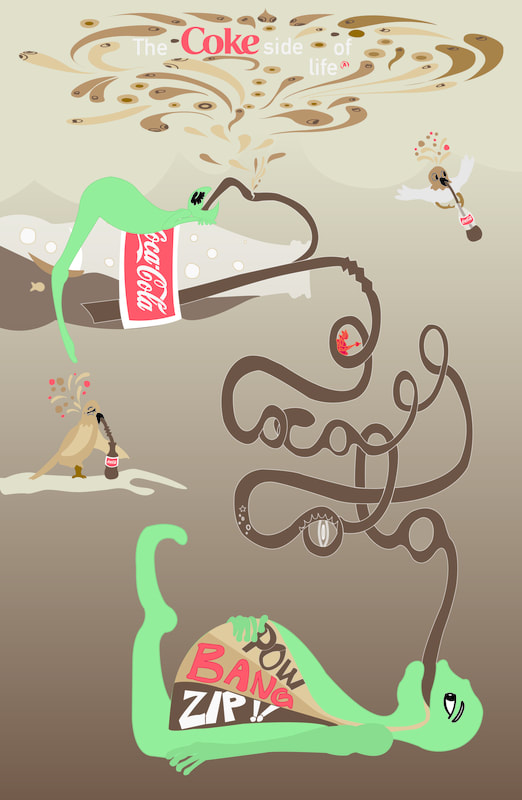 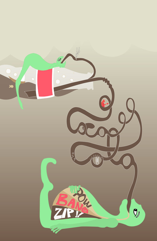 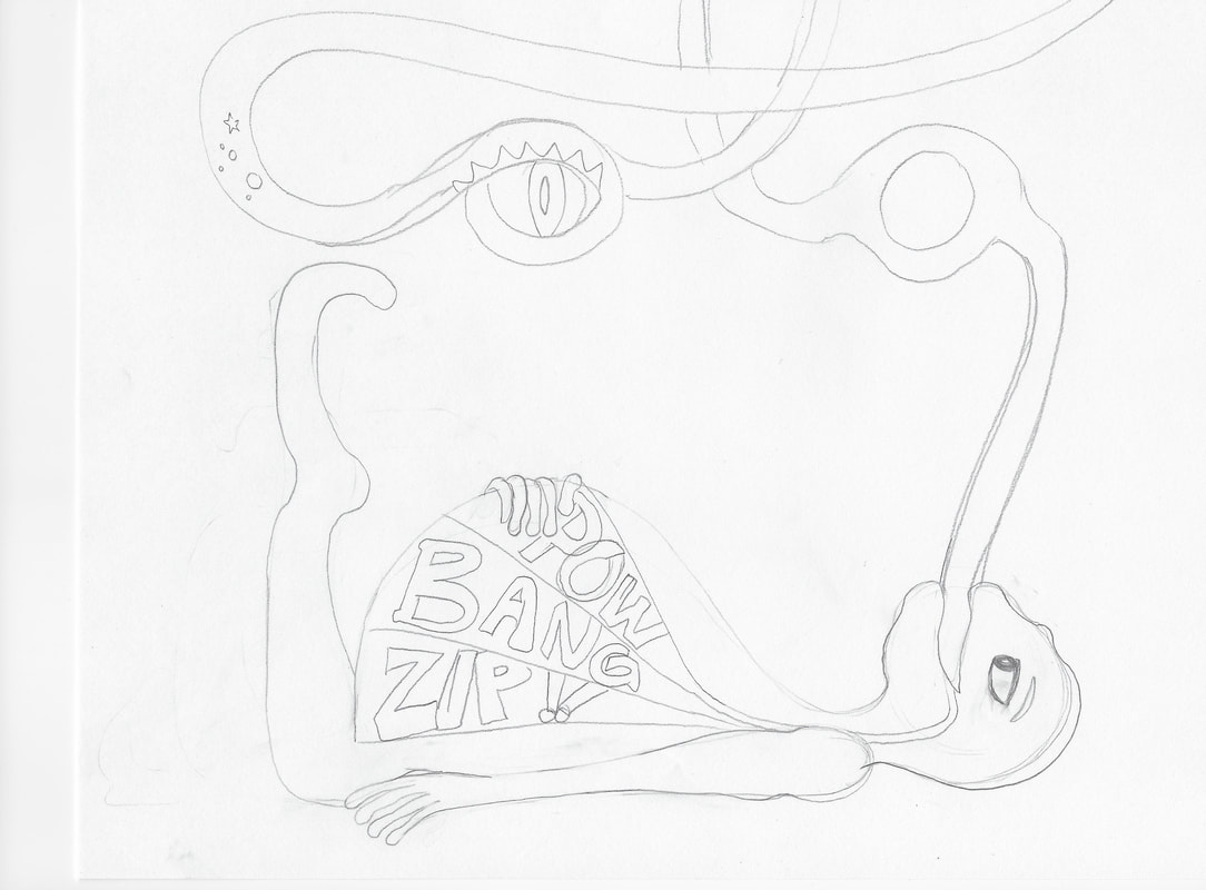 |
|
One of my all time favourite stories is Cinderella. Apart from the fairytale ending, which does make my heart glow a bit, it is the story about someone who perseveres to remain kind and generous and forgiving in the face of immense personal adversity. Someone who makes the best out of a bad situation through years of adversity. So as an homage both to this story, and the Disney film I wanted to create a poster that was fun and beautiful but which also looked at walking in other peoples shoes. I created 2 versions of the poster both of which have been created in Adobe Illustrator.
|
Cinderella Poster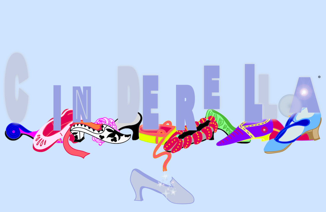 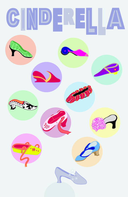 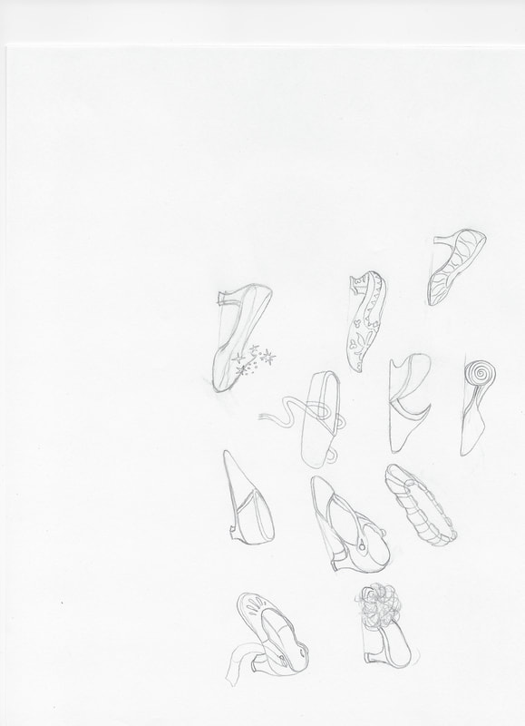 |
|
The National Film Board of Canada, or the NFB is known for its diverse history in influencing new media, film, and animation. Their logo is of an eye on a stick or what looks like an eye on an L. To me it looks like a little person. I wanted to make a few little NFB people to reflect the diversity of the work and influence of the NFB. For the poster, I wanted a historic yet modern sci-fi feel - rather Darwinian in nature. I also wanted a poster that would give reference old screens and pixels and also to Canada.
|
NFB Poster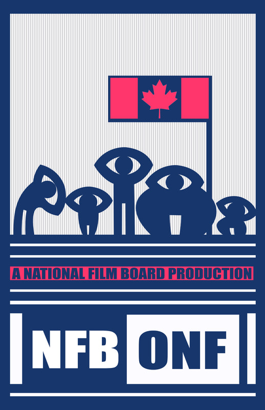 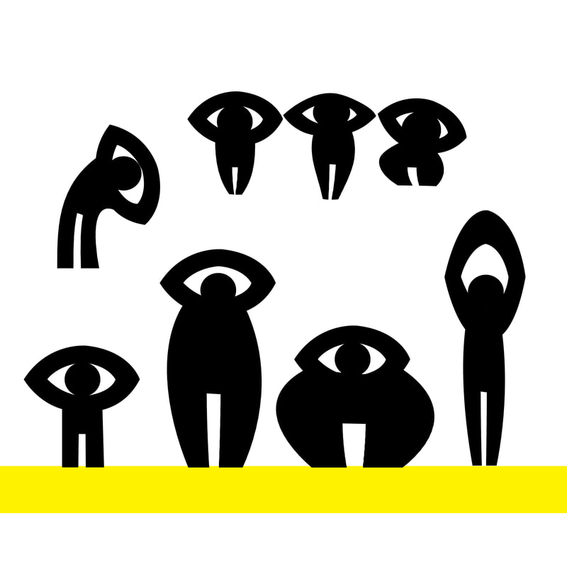 |
|
Back in March I began learning more about typography and layout through free Calarts courses hosted by Coursera.com online. At the end of the courses I had taken there was a bonus project of creating a poster that would discuss the environment. I decided to create a poster for children that was both illustrative and typographic in nature and which would influence children to want to talk about the pictures and their meanings and bring up conversation about the environment. I decided to turn those things in the natural world that I love or that make me sad into the letter for save our planet. Those things I love include many animals, and people caring for plants and animals, and trees. Something that makes me really sad is the killing and waste of sharks whose fins are often taken while the animal is thrown back into the sea, discarded to die. In a classroom this poster could be used to give students ideas for science discussion, to talk about the history of human waste, to influence an art class, or to discuss for ideas for creative story writing, or essay writing about the environment.
|
Environment Poster  |
|
Back in March I began learning more about typography and layout through a free Calarts courses hosted by Coursera.com online. The typography based course had us research a typeface and write about its creation and history. We were then to format the typeface in a document. The final project of this course was to create an informative poster based on this typeface that would both through visuals and typography tell about this typeface. I chose the typeface Georgia and made a few poster variations based on the research and writing I had so far created. The first poster speaks to the historic electronic significance of the typeface through use of a visual of an old computer monitor. The second looks a bit like an eye exam referencing the creation of this typeface to be read at miniscule size online. The third poster looks at the hand creation of typography historically and the creation today of typography created online.
|
Georgia Poster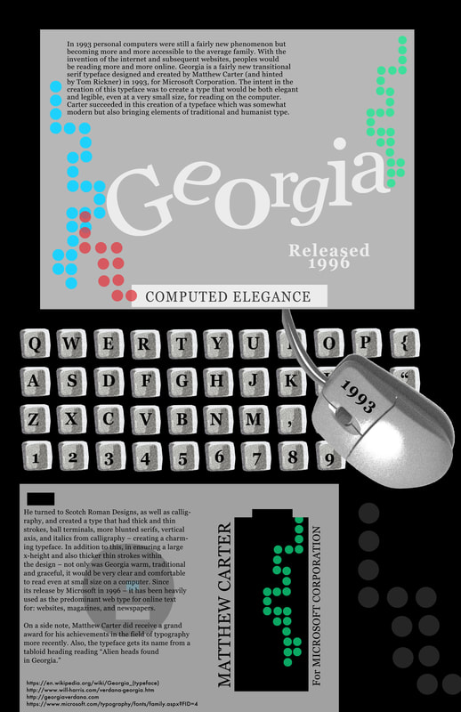 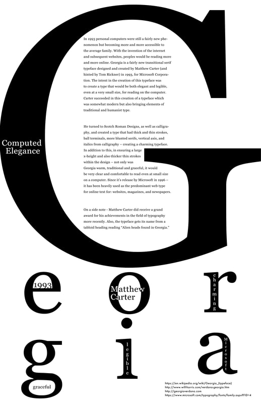   |
|
Back in March I began learning more about typography and layout through free Calarts courses hosted by Coursera.com, online. The course taken by which these posters were created was a course in the fundamentals of graphic design - image, type, space, pattern, and composition. In the first week we were to take an object and create 10 images of that object. I chose an egg. The second week was taking the word of our object and putting it into typefaces that were reflective of the essence of that object. The third week had us look at space and composition of elements to depict weight, texture, space, scale, form, and direction. For the fourth week we were to take all of the elements and create a music poster based on our original object, and using the typefaces we had chosen, and of course using the elements of graphic design fundamentals. I created a few posters. The first is for a music poster based on funk and art house styles, the second is based in the style of Art Deco.
|
Egg Poster 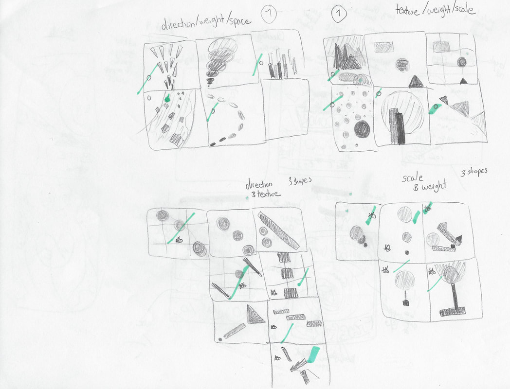 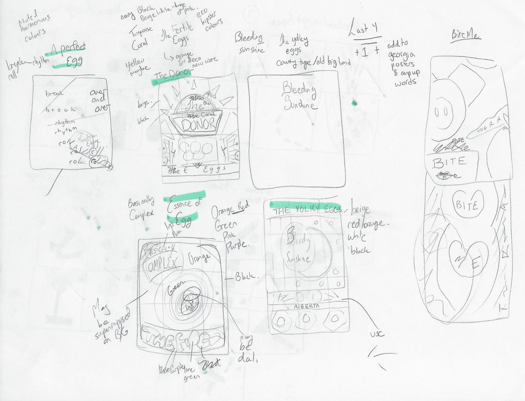 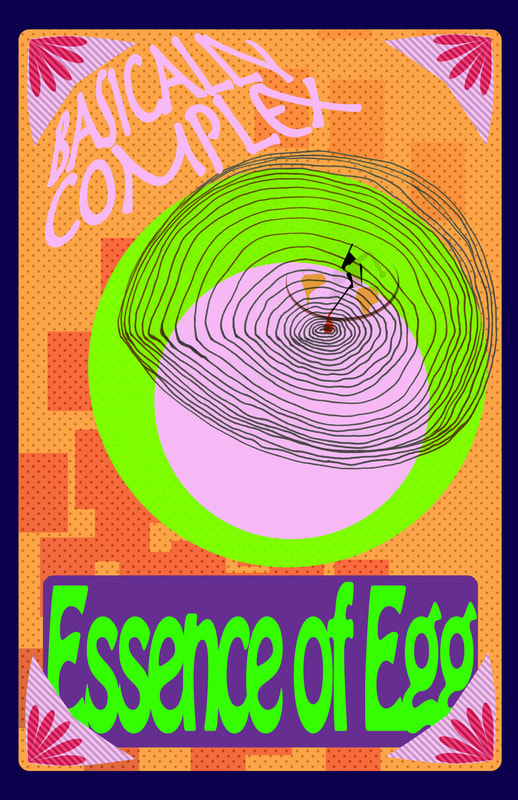 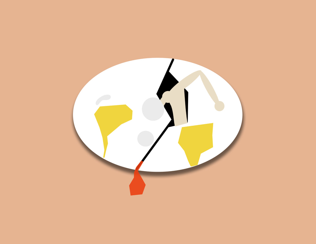 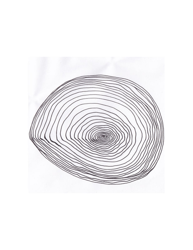   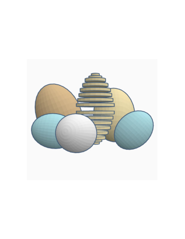   |
